
Services
Mobile Development
Mobile websites represent a massive opportunity to take your business to the next level while targeting customers on mobile devices.
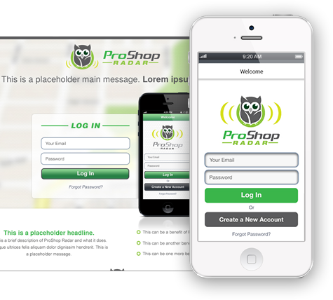
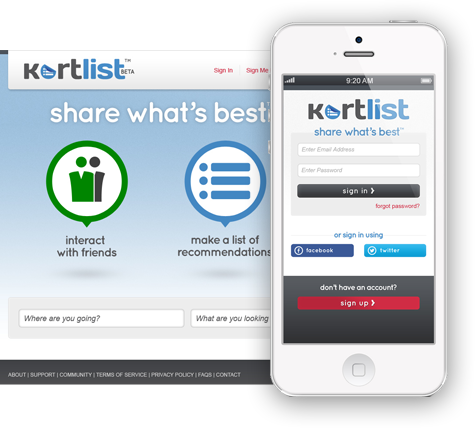
- Our team plans, designs, and develops stunning mobile websites that will take your business to the next level.
- Our mobile websites feature striking mobile web design and fast load times so that your business is sure to impress potential customers who visit your site on their mobile devices.
Request a Quote
Why do I need a mobile-friendly website?
Creating a website that works well both on mobile devices (of varying screen resolutions) and desktop computers does incur additional costs, but the cost of lost opportunity far outweighs that of the cost of accommodating mobile devices - especially considering the rapid growth of mobile adoption in the coming years.
Mobile visitors are task-focused
That means that when a potential customer visits your website on a mobile device, they are doing so for a specific purpose, such as call you, look for a piece of information, or need to get something from your website that very moment. Making their experience as enjoyable as possible will benefit you greatly.
Smartphone visitors are wealthier
A greater proportion of smartphone visitors are of the wealthy kind. It is likely to be in your best interest to serve these visitors very well.
Mobile Apps are used for business
Nearly three-fourths (72%) indicated they use mobile apps in their business, with roughly four in ten (38%) reporting they could not survive - or it would be a major challenge to survive - without mobile apps
It's another chance to differentiate yourself
The development of mobile websites has been slow by many companies. Why not be one of the first in your niche to adopt this strategy? It will set you apart, especially when you're competing for eyeballs from search engines. A visitor comparing your website to others' on a mobile device is much more likely to go with yours over a competitor's non-mobile-friendly website.
Can I make my website mobile-friendly
or do I need a separate website?
Often, the question comes up about whether you should have two or three different websites
(one for each type of device: mobile, tablet, and desktop).
We recommend that you have only one website that can adapt to all three.
You have three primary options when considering how to go about building a mobile website :

Responsive website design
This is where your website adapts to any given screen resolution. The website can adapt to tablet screen resolutions as well as mobile. This option requires more upfront planning than a typical website would since website content elements must be considered and given priority as screen sizes shrink. Responsive design websites are recommended by Google as the best for search engine optimization.
Separate style sheets
This is where you have one URL, but where (CSS) style sheets are modified depending on the device type that is accessing your website. This means using the same html code, but switching the style sheet that is used. It requires slightly less planning time than responsive websites.

Separate websites
This is where you have a mobile website that is found at, for example, m.yourwebsite.com, and a desktop website found at www.yourwebsite.com. The website redirects users to the correct URL based on what device they are on.